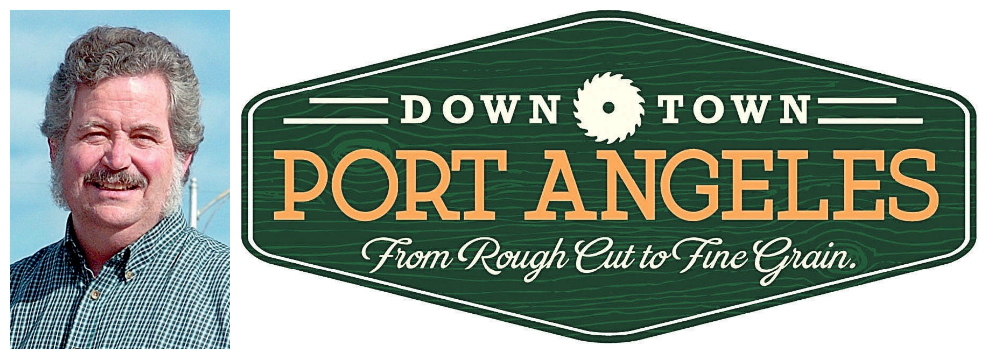
PORT ANGELES — Port Angeles Downtown Association President Bob Lumens went to a couple of meetings last week with a handheld circular saw blade hanging from his neck.
On the saw blade was printed: “Embrace the blade.”
“I was trying to lighten the situation a little bit,” Lumens, a downtown merchant, said in an interview last week after he emailed a newsletter to PADA members.
A proposed logo element offered by a consulting firm from South Carolina that included a circular saw caused a “firestorm” after a story and a picture of a circular saw were published in the Peninsula Daily News, Lumens said.
He is asking residents to be not so hasty in their judgment.
“It was incomplete. . . . It isn’t the whole substance,” he said.
The work was part of a re-imaging effort for the downtown sponsored by PADA, which paid Arnett Muldrow and Associates of Greenville, S.C., $12,000 to develop a logo, tagline and marketing plans.
The rebranding effort isn’t done yet, Lumens said. In fact, it has barely begun.
PADA will work with the consultants for another three months, Lumens said.
It won’t be until about the first of the year that everything will be in place, he said.
The rebranding effort extends far beyond the image of a circular saw blade, which is only one element of a proposed logo, Lumens said.
“I need to take a few minutes and correct a whole bunch of misinformation that has arisen since the branding project began,” he said in the newsletter emailed a week ago today.
Lumens blamed an image of a saw blade published in the PDN for much of the misinformation he wanted to correct.
The image was a picture of a circular saw, not the actual logo, which was not available.
“When the saw blade hit the paper, a firestorm started about what are they doing with a table saw blade,” Lumens said.
The image was presented with a story about the conclusions of brothers Ben and Tripp Muldrow after a three-day visit last month when they conducted five focus groups and explored the downtown.
On Sept. 26, the two unveiled a proposed logo with the tagline “Downtown Port Angeles: Rough Cut, Fine Grain.”
The silhouette of a circular saw blade incorporated into the logo was “a bit of a jarring image, and I did that on purpose,” said Ben Muldrow then.
Lumens said it’s too early to judge.
The tagline already has been tweaked, he said.
It now reads, “From rough cut to fine grain.”
And that’s not necessarily the final one, Lumens added.
“The focus of the branding was not saw blades,” Lumen said in the newsletter.
“We started as a logging town, not a sawmill town.
“In the first place, that saw blade is not representative of our past; it was just a saw blade,” he said.
The consultants said the blade could be replaced with other images for different times of year or events.
“It could be a rhododendron flower, a woven basket, an Easter egg or others,” Lumens said.
Responding to criticism that the consultants were from out of the area, Lumen said that “an RFP [request for proposals] was sent out locally, and the board carefully considered options and received input from other communities.”
Arnett Muldrow has worked on branding for about 300 communities across the country, including Gig Harbor, Wenatchee and Ellensburg in Washington state.
“They specialize in providing an out-of-town perspective to communities to help clients see what ‘works’ about their town,” Lumens said.
“We were looking for how we look to people from outside the community, i.e., our visitors, tourists and others who bring money into our economy,”
He also said that project was paid for with funds received from businesses that contributed to PADA through the Main Street Tax Credit Incentive Program, which allows businesses to receive a credit of 75 percent of their contribution on their business and occupation taxes the following year.
_________
Managing Editor/News Leah Leach can be reached at 360-417-3531 or at leah.leach@peninsuladailynews.com.

